
Most branded VPN rejections I write about are policy mismatches: Network Extension purpose strings, Play VpnService declarations, nutrition labels that forgot a crash SDK. That is a different post. This one is the listing. Screenshots, captions, previews, localized metadata. The stuff marketing wants to 'make pop' and review treats like a contract.
Apple's Review Guidelines are public. Guideline 2.3 is blunt: metadata, including screenshots and previews, should reflect the app's core experience. 2.3.7 tells you not to stuff prices and junk into screenshot text. 2.3.8 wants assets that still work at a 4+ rating even if the app is rated higher. 2.3.9 wants fictional account info, not a real customer's email. VPN apps also sit under 5.4. Read the live page. Do not screenshot my summary and call it legal advice.
I have watched partners ship a speed-test theater that would embarrass a router unboxing video: 940 Mbps on a Wi-Fi graph that is not the VPN, a 'military encryption' ribbon, a map with 90 cities they cannot name in a contract, and a privacy badge that looks like Apple's nutrition label but is a PNG. Then they ask why review bounced.
The bounce is not mysterious. The listing promised a product the binary did not show. Sometimes the binary is fine and the PNG is fan fiction. Either way you wait. Waiting with ads on is how a small brand lights money on fire. Shoot the app. Caption it like a coward. Cowards pass review.
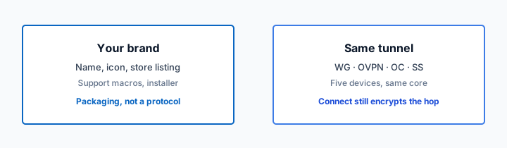
Klox white-label still means your developer accounts if you want a real brand. You own this packet. Reseller skips it because users install Klox. Consumer Klox is WireGuard, OpenVPN, OpenConnect, and Shadowsocks, five devices, from $2.83 a month, seven-day money-back — that price does not belong in your screenshot set. Apple said so.
If you are on a 14-day launch fantasy, shoot the real app on day two, not a Figma board on day thirteen.
I care about this more than founders expect because listing pixels are paid traffic. You can burn a week of ads on a screenshot that review then rejects, or on a screenshot that review accepts and users call a lie. Both are expensive. One also poisons the developer account. Shoot like the PNG will be read into the record. Because it will.
Play's feature graphic is part of the same exam even though this piece leans Apple. If the graphic is a hoodie and the binary is a connect button, you failed documentation on Android too. Google will not say 2.3. Apple will. Both still bounce a listing that does not look like the app. Save the hoodie for a billboard if you must. Not for the store. Not for review.
Related reading: White-Label VPN and Ip Reputation and White-Label VPN and Ipmi Exporter. White-Label VPN and IPV6 Toggle Copy and White-Label VPN and Ired on a branded site. What is a VPN? and Download KloxVPN.
Looking for a reliable VPN?
KloxVPN — from $2.83/month. Apps for every device.
Reviewers read the listing before they read your notes
A reviewer is a tired human with a checklist and a device. They open the listing. If the first three screenshots look like a different product than the binary, you have already spent goodwill. VPN is a sensitive category. You inherit the industry's junk: fake cleaners, 'unlimited speed' banners, maps that lie.
Your job is to look like a tunnel app. Connect button. Location list you actually have. Settings that exist. A privacy screen that matches what you tick in App Privacy. Boring wins.
PowerCert's explainer is useful for non-engineers who still think a VPN is a pirate hat. It will not design your 6.7-inch iPhone set. Apple's Packet Tunnel Provider docs will not either. They will remind you the product is a packet tunnel, not a lifestyle magazine.
- 1Skim the seating / order diagram.
- 2Do the numbered steps once on your real network.
- 3Use the FAQ if a sentence was too long.
- 4Follow one related article — not ten tabs.
How to read this page
| Asset | What partners ship | What review is sniffing | What to shoot instead |
|---|---|---|---|
| iPhone 6.7" set | Speed graph + 90 cities + 'No logs!!!' | Does the binary do this? | Home, connect, location list, settings, privacy |
| Caption overlays | Prices, 'better than Nord', 99.99% uptime | 2.3.7 junk and unverifiable claims | Short nouns: Connect, Locations, Kill switch |
| Account UI | A real user's email and last-four card | 2.3.9 real personal data | Alex Example, 555-0100, fake receipt |
| Nutrition-looking badge | DIY 'privacy label' PNG | Confusion with Apple's system UI | Your in-app disclosure screen, unedited |
| Play header graphic | Padlock on a night city, no VPN UI | Is this even a VPN listing? | The Android connect screen you shipped |
| Localized listing | English screenshots in a German storefront | Does metadata match the binary language? | Localized UI or honest English-only note |
If the overlay would feel slimy in review notes, it is slimy on the App Store. Delete it.
— KloxVPN operator notes
Apple App Store Review Guidelines
Cloudflare Learning: What is a VPN?
NordVPN (example of consumer listing theater — do not clone)
This is not the rejection-patterns post
That article is entitlements, declarations, demo accounts, nutrition forms. This article is pixels. You can pass policy and still look like a scam in screenshot one. You can also fail policy with perfect photography. Do both packets. Do not skip this one because a designer is 'almost done.'
Guideline 2.3 is the listing law
Read 2.3 through 2.3.10 on Apple's live guidelines. Core experience. No device frames that imply hardware you do not run on. No prices in screenshot chrome. No 'for kids' language unless you are in that category. VPN brands love 'protect your family' copy that drifts toward kids category language. Stay on the adult privacy product you actually are, or do the Kids Category work for real. Most white-label VPNs should not.
A screenshot set that matches the binary
Shoot the build you will submit. Not last month's staging. Not Figma. If kill switch is behind a paywall, do not lead with it as if it is free. If you have three locations in the picker, do not show a globe with pins on every continent.
Order them like a user story: what it is, connect, pick a place, settings that matter (protocol, kill switch if it exists), account without real PII. Five to eight images. More is not more if image four is a testimonial wall of five-star PNGs you invented.
Device size sets are a tax. iPhone 6.7, 6.5, iPad 13, iPad 12.9 — App Store Connect will tell you what is required this month. Do not crop a phone shot into an iPad slot and hope. It looks like a lie because it is one.
Status bar and debug leftovers
Personal notifications, 3% battery, an internal hostname in the subtitle, 'DEBUG' in the nav. I reject these in QA before Apple gets a chance. Use a clean status bar. Use a fictional account. Airplane the personal iMessage.
Dark mode and light mode
Pick one for the set unless you are showing a theme toggle as a feature that exists. Mixed mode looks like two apps. If 80% of your users are dark, shoot dark. Consistency beats a mood board.
Android is not a resized iPhone
Play wants a feature graphic and a phone set. Navigation is different. System VPN dialog is different. Shoot Android on an Android device. Reviewers notice Material vs UIKit even if your CEO does not.
Privacy nutrition labels vs what the screenshots imply
Apple's App Privacy labels are a form. Screenshots are a second form you did not mean to file. If the glass says 'we collect nothing' in a custom badge, and the App Privacy form lists crash logs and email, you handed the reviewer a contradiction.
Do not draw a fake nutrition label. It collides with system UI and looks like you are impersonating Apple. If you want a privacy screenshot, capture the real in-app disclosure — the one Guideline 5.4 wants before purchase or use — with readable type.
Play Data safety is the same trap. Feature graphic that says 'zero data' next to a form that lists account info is how you earn a policy letter.

What a honest privacy screenshot contains
The disclosure you actually show: tunnel goes to operator nodes, what account data you hold, a link or button to the policy. No 'NSA-proof.' No copied audit badge. Klox will not hand you a SOC 2 sticker in this article. If you do not have an attestation, do not paint one.
Crash reporters in the screenshot era
If the binary includes a crash SDK, the labels must say so. The screenshots must not say 'no analytics' unless you mean a very specific thing and the form agrees. 'Analytics' is a word that will hang you. Be narrower: crash reports, yes or no.
No fake speed-test theater
I have a low opinion of VPN speed screenshots. They are usually a speed-test site on fast Wi-Fi with the VPN off, or on a nearby exit with a caption that implies every city is like that. Users will test the far exit on hotel Wi-Fi and one-star you. Reviewers may not run iperf. They can still smell a 940 Mbps overlay on a product that never shows a speed graph in-app.
If your app does not include a speed test, do not screenshot a third-party test as if it were a feature. If it does include one, show it without a marketing ribbon that claims you beat a named competitor. 2.3.7 does not want you using the listing to punch other apps.
I linked a big consumer VPN's marketing site as an example of the theater culture. Do not clone it. Their ads are not your review notes. Rel is sponsored on purpose: that is their promo, not our endorsement.
What you can show instead of a graph
Connected state. Protocol name (WireGuard or OpenVPN) if the UI shows it. A location name you actually operate. That is the product. Speed is a lab number. Labs lie on WAN.
Streaming tiles are the other theater
A Netflix-looking row in a screenshot is how you pick a fight with a CDN and with review if it looks like you bundle someone else's app. Do not fake partner logos you do not have. 'Watch your usual apps' in body copy is already aggressive. In pixels it is worse.
Captions, prices, and other 2.3.7 junk
Designers love huge white text on a blurred phone: '$2.83/mo', '7-day money-back', '5 devices'. Those facts are real for Klox consumer. They still do not belong as screenshot chrome. Apple's rule is that screenshots should not include prices, terms, or descriptions that are not specific to the metadata type. Put price in the IAP or the website. Put devices in the description if you must. Keep screenshots as UI.
Competitor names in overlays are a tell. So are 'No. 1 in [country]' medals. Unverifiable claims are how 2.3.7 and 2.3.10 get involved. I would rather a listing look quiet than look like a landing page stuffed into a PNG.
Where Klox facts do belong
Your site, your ads, your help center, maybe the description if true for your brand. White-label pricing is yours, not ours. Do not put Klox's $2.83 in your branded screenshot. That is a different product.
Subtitle and keyword stuffing
2.3.7 also covers names and keywords. Screenshot text that repeats 'VPN proxy unlimited fast' is the same disease. Write like a human. The algorithm is not your editor.
Localized store listings that do not look machine-washed
If you localize the listing, localize the screenshots or admit they are English. A German description over English UI is common and a little sad. A German description over English screenshots with English overlays is worse. Reviewers in that storefront live there.
Do not run the UI through a cheap translator and shoot it. 'Kill switch' becoming something that sounds like violence in another language is a support problem and a rating problem. Use a translator who has seen a VPN app.
If you only have budget for English, stay in English. A smaller honest footprint beats ten locales of nonsense. You can add locales when the binary strings are actually translated.
Right-to-left and overflow
Arabic or Hebrew screenshots that clip the connect button are how you look unfinished. If you have not tested RTL, do not publish RTL screenshots.
Play translation vs App Store localization
Different consoles, different asset sizes, different character limits. Treat them as two jobs. Copy-paste will overflow a subtitle and look like spam.
Preview videos and the 30-second honesty test
App previews are optional until marketing insists. If you shoot one, show the real connect flow, including the system VPN permission dialog. That dialog is the product. Do not hide the permission to make the preview look slick. Users will see it anyway.
Do not dub fake speed numbers. Do not show a map animation of cities you cannot serve. Fifteen seconds of a thumb hitting connect and a status flipping to on is enough. I would rather a quiet preview than a trailer with whooshes.
Audio and faces
Stock music is a license problem. A real employee's face is a consent problem. A customer's face is a 2.3.9 problem. Use the UI. Silence is fine.
Play promo video
Same rules. YouTube compression will smear small type. If the disclosure text is in the video, make it large. Tiny legal text in a promo is how you look like you are hiding.
Feature graphics, icons, and looking like a knockoff
Play's feature graphic is 1024×500 of temptation. Padlocks, globes, anonymous hoodies. You look like 200 other listings. Shoot the product. Icon should not clone a competitor's mark. That is trademark and 2.3 uniqueness.
Guideline 2.3.8: metadata should be appropriate for all audiences at 4+ even if the app rating is higher. No gore, no sexy 'spy' art. VPN brands drift into trench-coat noir. Skip it.
You are responsible for rights to every pixel. That includes fonts, illustrations, and the fake map tiles. If a contractor grabbed Unsplash and a font they did not license, you own the takedown.
Default white-label icons
If ten partners ship the same template icon with a color swap, you look like a kit. Spend a day on a mark. Inherited UI is fine. Inherited identity is not.
Screenshots of other apps
Do not include Instagram in a split-tunnel screenshot unless you must, and even then you are showing a third-party brand. Prefer a generic 'Browser' or your own empty WebView. Avoid a collage of streaming logos.
A shot list you can run in one afternoon
Device farm or a current iPhone and Pixel. Production-bound build. Fake account with a password in 1Password for review. Clean status bar.
Shots: (1) home disconnected, (2) system permission if you can capture it legally in a preview, (3) connected, (4) location list that is true, (5) protocol picker if you have WireGuard, OpenVPN, OpenConnect, and Shadowsocks toggles, (6) kill switch if it exists, (7) in-app privacy disclosure, (8) help or settings without debug. Stop.
Export at the exact pixel sizes App Store Connect and Play Console demand this quarter. I will not freeze a pixel chart here; the consoles change. Look it up the day you export.
Then sit with the person who filled App Privacy and Data safety. Flip through the PNGs. Any contradiction dies now, not in review.
If you only have one device, shoot that device well. A sharp Pixel set plus a missing iPad set is a known submit blocker, not a style choice. Borrow hardware. Do not upscale. Reviewers have seen upscaled UI; it looks like oil on water. If a contractor delivers 'iPad' screenshots that are phone UI with fake bezels, send them back. You will still be the developer of record when Apple shrugs.
What not to schedule for 'later'
iPad. Localized sets. The Play feature graphic. Later is how you submit with placeholders and get a metadata rejection that burns a week.
Version-to-version drift
UI moved, screenshots did not. That is a 2.3 miss. Put 'update listing assets' on the same checklist as the binary. White-label vendors may ship a UI change under you. You still click the asset upload.
The week-of-submit ritual for listing assets
Pick a freeze day. Binary locked. Strings locked. Then recapture. I do not trust screenshots from two sprints ago. A connect button that moved 12 pixels is enough for a reviewer to feel baited. Export every required size the same afternoon. Name files like `ios-67-01-home.png` so a tired person can upload without guessing.
Sit with App Privacy and Data safety open. Flip the set. If image two implies 'nothing collected' and the form lists email plus crash logs, kill the overlay. If a German listing is going live, check that you did not upload the English set to that locale by habit. Console UIs make that mistake easy.
Then watch the preview video on a phone speaker, muted, then with captions. If the system VPN dialog is cropped, recut. If a notification from your bank floats in the status bar, recut. I have failed my own QA on that. It is cheap to fix at the desk and expensive in review.
Budget two hours, not 'the designer will handle it.' Designers optimize for conversion. Reviewers optimize for consistency. You need both in the room, or you need one person who is allowed to veto a speed graph.
A packing list for the zip you keep
Source captures, exported sizes, locale, build number, date, and the name of the person who approved overlays. When a store asks 'why does this screenshot show a city you do not list,' you can answer in five minutes instead of a day of Slack archaeology. White-label vendors will ship UI changes. Your zip is how you notice.
What to do when marketing wants one more badge
They will. 'No logs.' 'Audited.' 'Fastest.' Offer them the description field and the website. Offer them an honest in-app privacy screen as a screenshot. Do not offer them a fake nutrition label or a competitor punch. If they insist, make them read Guideline 2.3 aloud. It is a short walk to the live Apple page. I have done that walk. It ends arguments faster than taste does.
White-label process: who holds the pixels
Confirm who exports screenshots. If the platform gives you a default set, treat it as a draft. Replace city counts you cannot defend. Replace their name. Replace any speed theater they included for 'conversion.'
You still submit. You still own 2.3. A vendor link in review notes does not excuse a lying PNG.
If you do not want this job, resell Klox and send people to our listings. That is a valid motion. It is not a lesser motion. It is how you skip the shot list.
Where to put the real numbers
Pricing page, download page, ads with whatever the ad network allows. Consumer Klox: five devices, from $2.83 a month, seven-day money-back. Your brand: your numbers. Keep them off the screenshot overlays.
When to talk to us
White-label if you want the branded client and you will own the listing. Contact if your store identity is messy. Do not ask us to fake a speed graph. We will not.
Key Takeaways
Listing assets are review. They are also ads you cannot unsay. Shoot the binary you submitted. Keep overlays to short nouns. Do not invent a nutrition badge. Do not stage a speed test. Localize for real or stay in one language.
Apple's 2.3 and 5.4 are the text. Your PNGs are the exam. Play will judge the feature graphic the same way: is this a VPN, and does it match the form.
I would rather you convert 10% worse with honest glass than win a week of installs on theater and lose the account to a metadata strike. The shot list is an afternoon. The rejection is a week. Do the afternoon.
Keep the Apple guidelines tab open while you export. 2.3 and 5.4 are not vibes. They are the text the reviewer has. If your overlay would look silly next to that text, it is silly. Cut it. Ship.
If a contractor says they can 'just use last quarter's set with a new logo,' that is how you ship a city you no longer have and a kill switch you moved behind a paywall. Recapture. Always recapture. The hour you save is the week you donate to review.
If you want a branded client and you are willing to own the listing, talk to us about white-label. If you do not want store pixels, sell Klox as Klox.
Related Resources
Brand the client. Shoot the client you actually ship.
White-label is your name on the Klox network. You still own App Store and Play listings. Bring a shot list, not a speed graph.
Talk to us about white-labelFrequently Asked Questions
KloxVPN Team
Experts in VPN infrastructure, network security, and online privacy. The KloxVPN team has been building and operating VPN services since 2019, providing consumer and white-label VPN solutions to thousands of users worldwide.